Increasing Retention and Reducing Cancellations
Working within our Loyalty Squad to increase value perception almost subscription members.
Stakeholders: Apps and Memberships Product Squads, CRM, Product Design
Tools: Typeform, Miro, GoogleSuite,
Methods: Surveys, Unmoderated Testing, Workshops, Data Analysis
October 2026 to June 2026
Problem
Moonpig Plus is an annual subscription offering benefits including 30% off all cards. As our early members entered their third year, we noticed cancellations creeping up—even with auto-renewal enabled.
To understand why people were leaving, I ran a survey covering six months of cancellations. The breakdown showed that 35% were involuntary due to failed payments, while the remaining 65% were intentional cancellations.
This research highlighted a big value perception problem. I combined this with a deeper dive into benefit motivations and barriers and we uncovered three key insights:
Out of sight, out of mind: Some members simply forgot they had an active Plus subscription.
Unclear benefits: Most members rarely used perks beyond the main 30% card discount.
8% couldn't name a single benefit.
Two-thirds had a broad awareness of discount and saving related benefits but most couldn’t recall specific mechanics.
25% assumed free delivery was included (it wasn't!).
Low value perception: 60% of voluntary cancellations came from members feeling they weren't getting enough value—even though the data proved otherwise:
85% of respondents had easily saved more than the £9.99 subscription cost.
52% saved over £20, yet still doubted the value.
While we showed customers savings on individual orders in flow, members had no dedicated spot to see their total, long-term savings. Members had no idea what was going on with their subscriptions.
Hypothesis
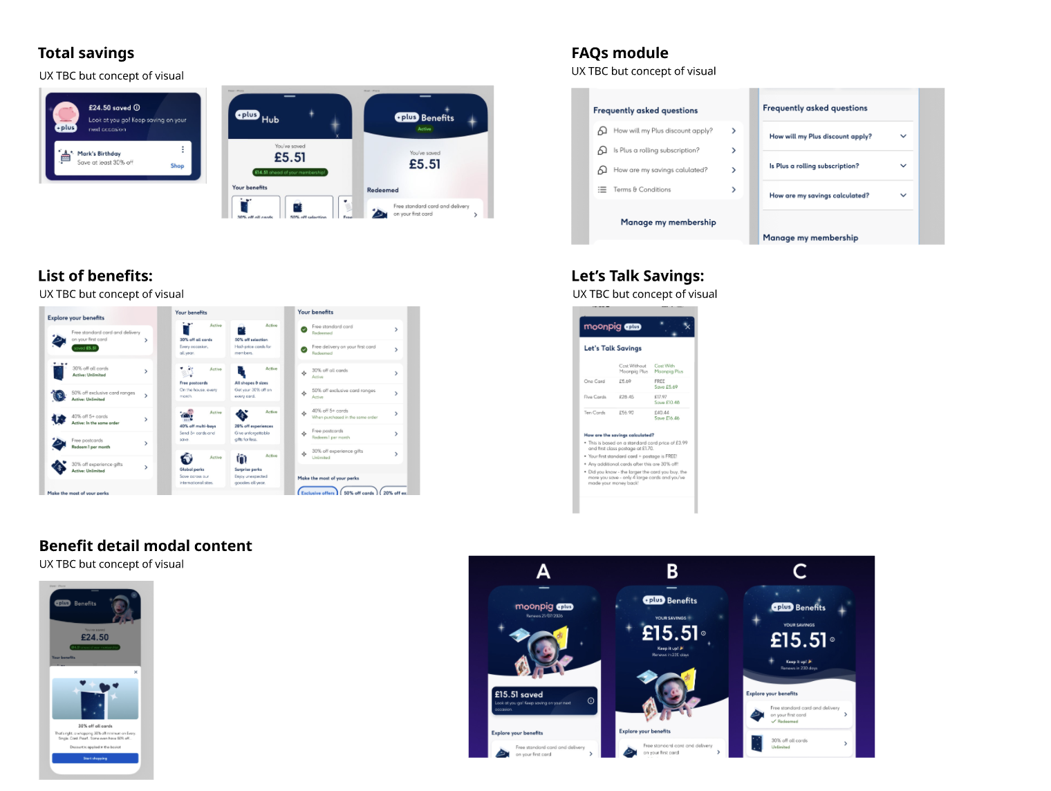
We hypothesised that creating a centralised area for Plus members would help prove the value and increase awareness of benefits - encouraging customers to make the most of their subscription. The dedicated "Plus Hub" would showcase total savings and active benefits would make value unmistakable, encourage return visits, and boost retention.
We also believed showing prospective members potential savings based on past purchases would encourage new sign-ups.
Research Methods and Process
Initial surveys: Used Typeform surveys and CRM data to understand why members cancel.
Ideation workshops: Facilitated cross-functional team sessions to identify opportunities to surface benefits and value clearly.
App prototyping: Worked alongside designer to build interactive prototypes and alternate designs for a new Plus Hub experience.
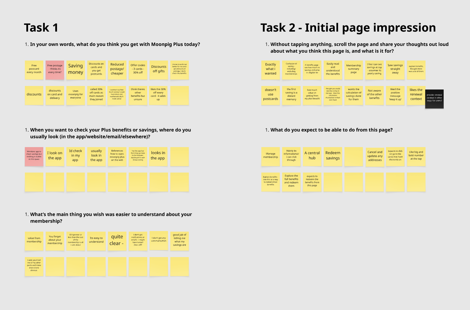
Unmoderated user testing: Validated layouts and design directions with users. Key testing goals included finding out:
Which design best communicated total value at a glance?
Which layout made benefits easy to digest and navigate?
Is this effective as a tool for non members to encourage sign ups?
Iterate & test: Refined designs based on user feedback, then ran A/B tests on the app.
Roll out to app and web
Findings
User Test Findings showed:
Validation & core value: Users loved the Plus Hub concept! They saw it as a helpful digital "receipt" confirming their savings outweighed the £9.99 fee.
The "net profit" mental model: Members evaluated savings directly against their fee. They wanted explicit "Net Savings" totals so they wouldn't have to do the mental math themselves.
Reducing friction: Popup modals added slight friction, but provided much-needed clarity on discount details. Users also requested moving already-redeemed perks to the bottom to keep new offers front and center.
Winning layout: The winning concept combined the warm visuals and countdown timer of Design B with the clear, scannable vertical list of Design A. Horizontal carousels were unanimously rejected.
Clearer ROI messaging: We recommended adding explicit timeframes (e.g., yearly vs. lifetime savings) and displaying net savings based on real user data.
Removing ambiguity: We replaced vague language like "Surprise Perks" with concrete examples and added clear "Was/Now" pricing to featured discount collections.
Impact
The initial research impacted the product roadmap through highlighting the reasons why customers were cancelling. It validated problems and gave the team license to focus on a solution.
Redesigned Plus Hub went live in app (June 2026), followed closely by web.
Renewal rates increased by ~7% YoY—even alongside a subscription price increase.
Added a dedicated Plus header in the app to highlight membership status and drive hub traffic.
Lifted member conversion rate (CVR) by +0.76% and top-of-funnel CVR by +0.33%.
Partnered with CRM to launch targeted win-back campaigns around key renewal dates. Research highlighted a group of customers willing to come back at the right time - and so win-back campaign was built around the next occasion / saved Reminder.
Introduced "Milestones"—a reward initiative giving members small perks (like free delivery) when hitting savings targets.
62% of members reported higher satisfaction with Moonpig Plus.
61% agreed Milestones effectively demonstrated the value of Plus.
Supported strategic shifts to the core proposition:
Streamlined benefits to cut cognitive overload and save company costs on unused perks.
Explored adding free delivery as a core benefit to tackle a major barrier to purchase frequency.
Phase 2 to come: Expanding the Plus Hub preview to non-members to encourage subscription sign-ups.
Learnings
Focus is key—avoid trying to tackle too many initiatives at once. It’s difficult to measure success as we rolled this out alongside changes to the proposition including a price increase.